

Design that makes a store feel like the brand and easy to shop.
Design
Our design practice
Design is the fastest signal a visitor gets about whether you're worth trusting. We build visual systems that read as expensive, hold up across every page and screen size, and, critically, survive contact with the real world once your team is the one adding content to them.
Look and feel
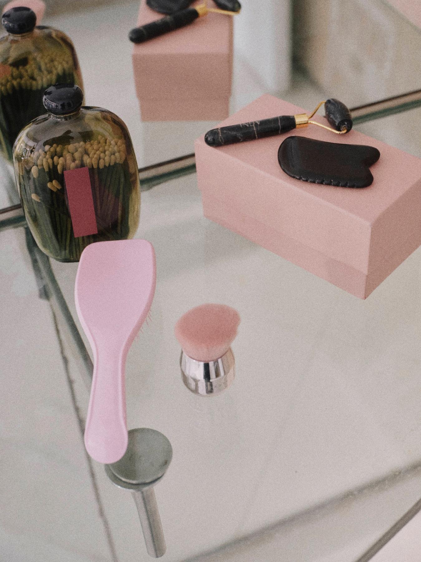
A store that looks and sounds like your brand.
Look and feel
- Store designPage designs for desktop and phone that look like your brand.
- Creative and art directionKeeping every photo, page and campaign true to one brand vision.
- Branding and identityLogos, colors and type that belong to you and work everywhere.
- Design systemsA kit of reusable parts that keeps every new page consistent.
- Motion and interactionAnimation and small interactive touches that make the store feel alive.
- Photo and video directionWorking with your photographers so every shoot gives you pictures the store can use.
- CopywritingWords that tell your story and help people find you in search.
- Packaging designBoxes and labels that carry the brand into the customer's hands.
- Email designOrder and marketing email templates that match your store.
- Content planningDeciding what to say at each point in the customer's journey.
- Design reviewsOversight that keeps designs on standard while they're being built.
Shopping experience
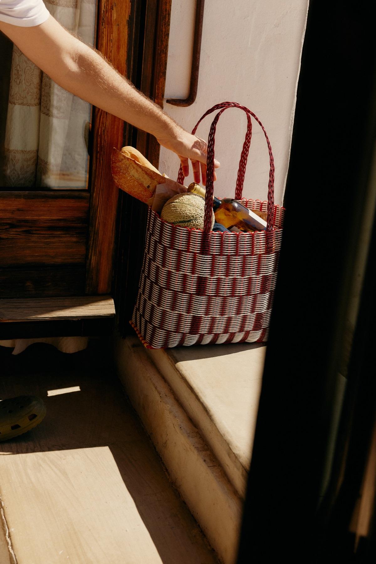
Every step from first visit to checkout, made easier.
Shopping experience
- Shopping experience (UX) designDesigning each step from first visit to checkout, guided by how people actually shop.
- Testing with real shoppersWatching real people use your store to see where they get stuck.
- Menus and site structureOrganizing menus and collections so shoppers find things quickly.
- Feature prioritiesChoosing the features that will make the biggest difference first.
- WireframesSimple page layouts that settle what goes where before design starts.
- Experience reviewsClear recommendations drawn from your data, customer feedback and best practice.
How we work
- 01
Direction
We agree the visual territory before producing finished screens. References, tone, and the feeling we're aiming for. Cheap to change at this stage, expensive later.
- 02
Key screens
We design the homepage and one commercial template first. These carry the overarching system, so approving them approves most of the design language.
- 03
System build-out
Remaining templates, components, and states: empty, loading, error, long content. The unglamorous cases are where most designs quietly break.
- 04
Developer handoff
Documented components, spacing scales, and behavior notes, walked through live with whoever is building it so nothing is lost in translation.
Common questions
Do you do logos and full brand identity?
We do visual identity systems for digital: type, color, layout, photographic direction, and component design. If you need a full brand identity including logo design and print applications, we'll tell you honestly whether we're the right fit or bring in a specialist partner.
What if we already have brand guidelines?
That usually speeds things up. We'll work within them and extend them where they don't cover digital, which is common, since most guidelines were written for print and social and go quiet on component states and responsive behavior.
What tools do you design in?
Figma, with components and variables set up so the file stays useful to you after handoff rather than becoming an archive nobody opens.
Can you design without doing the build?
Yes. We hand off a documented system and walk your development team through it. That said, design and build with the same team removes a whole category of translation problems, and it's usually the cheaper path overall.
Ready to start on design?
Tell us about your brand and what isn't working. We'll tell you straight whether this is the right place to start.