

Free website audit. We’ll show you exactly what’s costing you conversions. Book yours

12PM Studios

12pmstudios.com
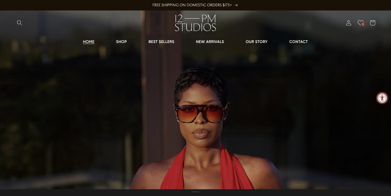
12PM Studios homepage on desktop

Shopify Design Revamp & Custom Development

12pmstudios.com

Summary

12PM Studios is a lifestyle brand that starts with eyewear. The name comes from midday light, the moment the sun sits at its peak and everything reads clear, steady, and deliberate. The brand is built on the idea that luxury isn't excess or exclusivity; it's intention and detail you can actually live with.

It was founded by Jenee Naylor and Joshua Prieto, a husband-and-wife team who brought two halves of the same instinct: an editorial eye for fashion and a photographer's approach to storytelling. The result is a catalogue of frames, Toronto and Milan and Monaco and Copenhagen and London, shot like a magazine rather than a product feed.

12PM Studios Milan Pearl campaign, shot on location in the desert
12PM Studios Toronto Yellow Lens campaign, shot on location in the city

The Problem

The brand was sharper than the storefront selling it. 12PM Studios had exceptional campaign photography and a clear point of view, but it was running inside a stock theme that flattened both. Faces were cropped out of hero images. Editorial art direction collapsed on mobile, where most of the traffic was.

The commercial side had the same ceiling. The merchandising ideas the founders wanted, such as saving frames for later, colourway previews on collection pages, threshold-based shipping incentives, gift-with-purchase promotions, and early access to drops, simply don't exist in a default Shopify theme. Each one either needed an app subscription with its own performance cost, or it needed building.

The Solution

We took it on as an ongoing partnership rather than a one-off rebuild. A revamp of the design followed by continuous custom development against whatever the business needed next. Over roughly seven months that came to 266 hand-written commits on top of the theme.

The design work was mostly about making the photography survive the template: focal-point control so faces clear overlay text, mobile-first placement of captions and buttons, collection grids retuned for phones, and a header that stops fighting the imagery behind it.

The development work was building the merchandising features outright, so the brand owns them instead of renting them. Each one below shipped to production, and each one is something we can build again.

12PM Studios Milan Tortoise Nude campaign, shot poolside
266
Custom commits
7
Months and counting
0
Apps rented for it

What we built

Everything here was written for this store rather than installed. If you want the same, these are the pieces worth asking about. We'll scope them to your numbers, not someone else's.

01

A wishlist, built from scratch

Shoppers save products from any product or collection card, see a live count in the header, and manage everything on a dedicated page with add-to-cart built in.

Considered purchases rarely convert on a first visit. A wishlist captures that intent without forcing an account signup, and every action is tracked so you can see what gets saved but never bought. Ours ships with its own test suite and an on/off switch in theme settings, so it can be turned off without a developer.

02

Free shipping progress bar

A live bar showing how close a customer is to your free-shipping threshold, shown only in the markets where the offer applies.

Threshold nudges are one of the most reliable ways to lift average order value. The market awareness matters more than it sounds. Showing a domestic-only offer to an international customer is a broken promise at checkout.

03

Automated gift-with-purchase

Qualifying items in the cart trigger the gift to be added automatically, and removed again if the cart stops qualifying. The promotion starts and ends on a schedule you set.

Most promo mechanics need someone watching the store. This one runs unattended and turns itself off on time. Pricing is enforced server-side rather than in the browser, so the promotion can't be gamed.

04

Variant swatches on collection pages

Colourway swatches rendered directly on collection cards, with second-image hover and correct sold-out states.

A product that comes in five colours looks like one product until someone clicks. Surfacing the range on the grid means shoppers find the version they want without bouncing between pages.

05

Early access for drops

Gated access to unreleased products for customers holding the right link.

Lets you run genuine private drops for VIP lists, partners, or press on the live store, without staging a second site or handing your product data to an app.

06

Market-aware merchandising

Region-specific product routing, so the same homepage module sends shoppers in different markets to the variant they can actually buy.

When catalogue availability differs by market, a single hardcoded link sends half your traffic to something unavailable. This fixes the leak without duplicating the storefront.

07

Art direction that survives the CMS

Per-image focal point and crop control, mobile-specific overlay placement, taller collection heroes, and text positioned so it never lands on a subject's face.

This is the unglamorous half of a design revamp. Campaign photography is expensive; a template that crops the subject out of it wastes that spend on every screen size you didn't check.

08

Measurement and polish

Analytics event tracking across wishlist and cart actions, session recording, affiliate platform integration, high-DPI logo rendering, and a sticky header that transitions cleanly instead of flashing white on scroll.

The tracking makes everything above evaluable rather than assumed. The polish items are the sort of thing customers never mention and always notice.

What the shipping bar did

The free shipping bar went live on a known date, so we compared the sixty days on either side of it. The result was not the one you would predict.

+9.9%
Orders
+6.2%
Revenue
−1.8%
Average order value

Average order value went slightly down, not up. Orders rose almost ten percent and revenue over six, while the average basket shrank by under two percent.

The most likely reading is that the threshold bar converted baskets that would otherwise have been abandoned, rather than enlarging baskets that were already converting. More orders, marginally smaller, materially more revenue.

That is a good outcome. It is not the outcome a case study would normally claim for a threshold nudge, which is why we would rather show the actual shape of it than round it into a headline.

These are before and after figures from a live store, not a controlled experiment. The two periods sit in different parts of the calendar, other work shipped alongside, and marketing activity varied. We report them because they are the numbers that exist, with the caveat attached rather than buried.

The services behind this

This project ran across design and build, then continued as an ongoing optimisation partnership.

Want this for your store?

If you're running a brand whose photography deserves better than the theme it's sitting in, or you need merchandising features that don't come in a box, this is the work we do. Tell us what's not working and we'll tell you what it takes.