



01
Why this matters
A new site goes live, it looks better, and everyone agrees it feels better. Three months later someone asks whether it actually sold more, and nobody can say. The numbers from before the launch were never saved, or they were measured differently, or the launch happened to land in the middle of a sale.
The fix takes about an hour, and it has to happen before any work starts: write down how the current site performs, so there's something to compare against later. That snapshot is called a baseline.
02
What to write down
You don't need every metric. You need the handful that describe how shoppers move from arriving to buying:
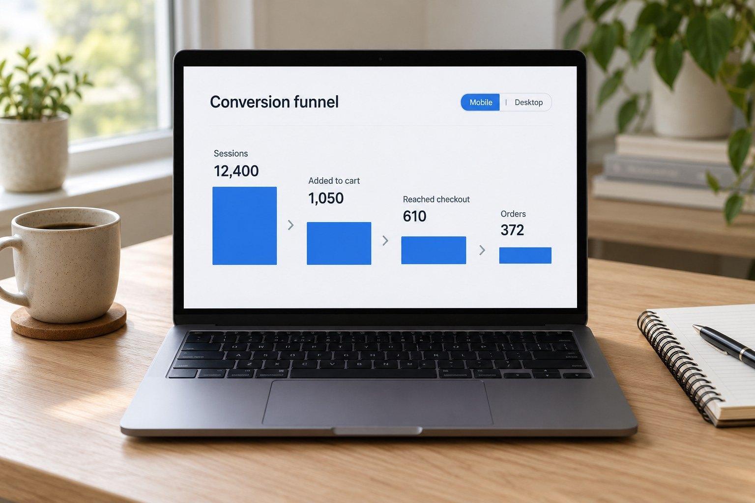
- SessionsHow many visits the store had. Useful mainly as context for everything else.
- Add-to-cart rateThe share of visits where someone added a product to their cart. It tells you whether product pages are persuading.
- Checkout rateThe share of visits that reached checkout. A big drop between cart and checkout often points to surprise costs or a clumsy cart.
- Conversion rateThe share of visits that ended in an order.
- Average order valueTotal sales divided by the number of orders.
- Mobile vs. desktopAll of the above, split by device. Most stores get most of their traffic from phones, and the two often behave very differently.
In Shopify, most of these are in Analytics, in the conversion reports that show how visits move from added to cart, to reached checkout, to completed. Save a screenshot and the exact dates alongside the numbers.
03
Compare fairly
A before-and-after comparison is only as good as the two periods you pick. Three rules keep it honest:
- Same lengthCompare 30 days with 30 days, never a week with a month.
- Same kind of periodA December will beat a February on almost any site. If your sales are seasonal, compare with the same weeks last year as well.
- Note what else changedA big ad push, a price change, a sale or a press mention can move the numbers more than any design. Write them down with the dates.
Where there's enough traffic, the strongest proof is an A/B test: half the visitors see the old version and half see the new one at the same time. That removes seasons and sales from the comparison entirely.
04
Then ask one question
Numbers tell you where shoppers drop off. They don't tell you why. Before redesigning a page with a weak add-to-cart rate, ask visitors directly with a small on-page poll: "Is anything missing from this page?" Offer yes or no, and if they say yes, ask what.

The answers are often things no one on the team thought of: a size chart, a photo from the side, a clearer shipping date. That tells you what the redesign actually needs to fix.